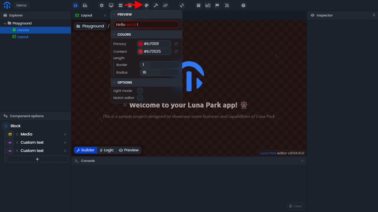
Tokens and Style Variables
Tokens are reusable values that define the visual foundations of your application (colors, sizes, spacing, fonts, etc.). They ensure style consistency and allow you to modify the global appearance without having to edit each component individually.
For example, if you modify the primary-color token, all areas using it will be updated instantly.
Using a Design Token
- Hover over the value you want to modify.
- Click the icon to activate token selection mode.
- Select the design token you want to use.
Note: Tokens replace hardcoded values and serve as a basis for global style customization.
Style Variables
Style variables allow you to make your components dynamic: a color, size, or property can change based on the state or data of your application.
Unlike tokens, which are static and global, variables are contextual and reactive. They are used to visually adapt components according to your application logic (e.g., if loggedIn = true, then color = success-color).
Using a Style Variable
- Hover over the value you want to link to a variable.
- Click the icon to switch to variable selection mode.
- Select the variable you want to use.
Note: Only variables compatible with the property type will appear in the list. For example, a numeric variable will only be available for a number type property.