Layout and Alignment
Layout controls how elements are organized in space. Luna Park uses CSS layout principles, but in a visual interface.
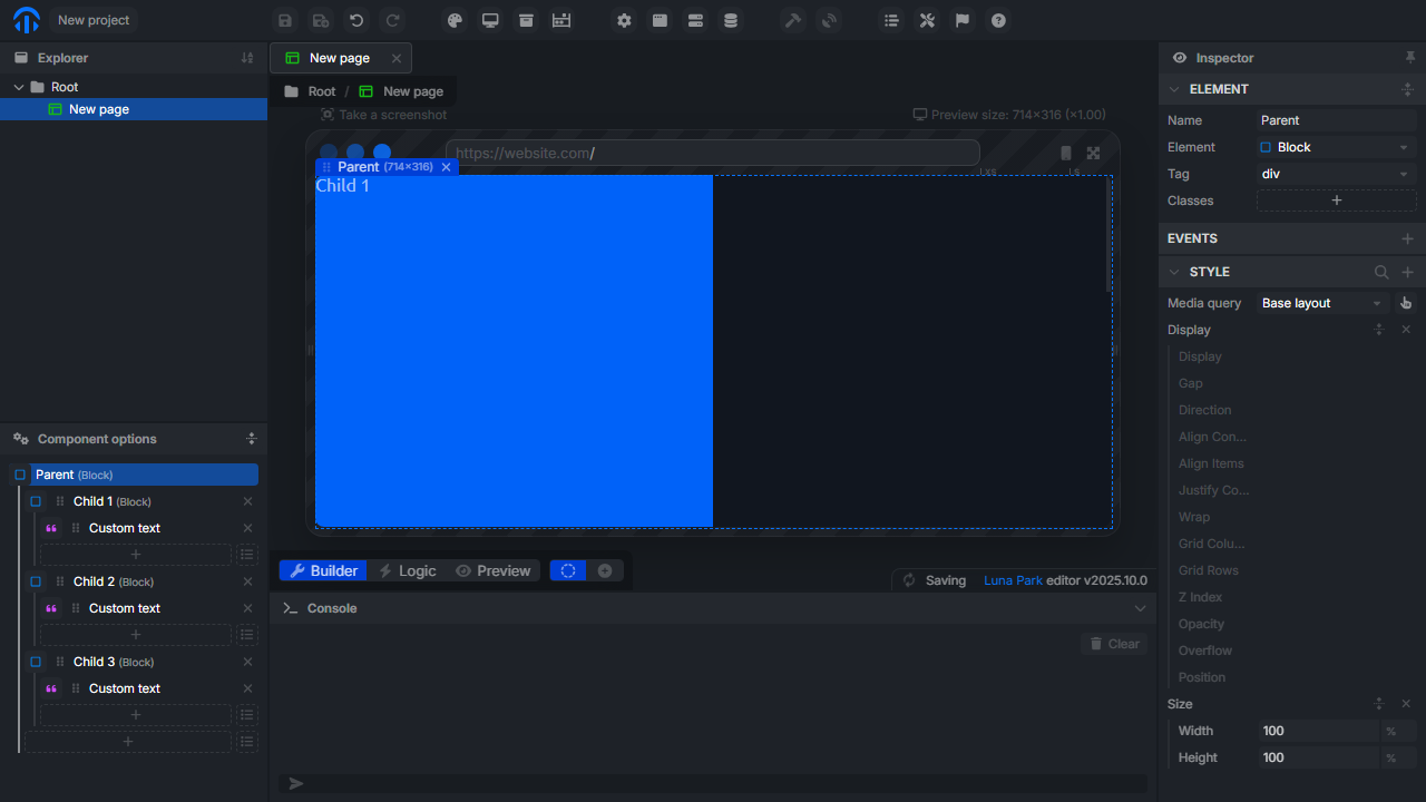
Container and Children
Each element acts as a container block (parent) that can organize its children. Layout properties therefore apply to the parent, while alignment influences the position of children inside.
Layout Type
You can define the main layout mode of the element:
| Mode | Description |
|---|---|
| Block | Elements are placed one below the other. |
| Inline | Elements are displayed sequentially on a line. |
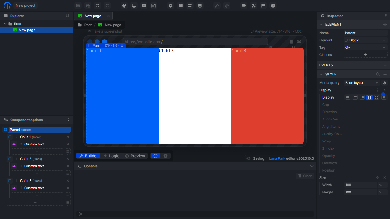
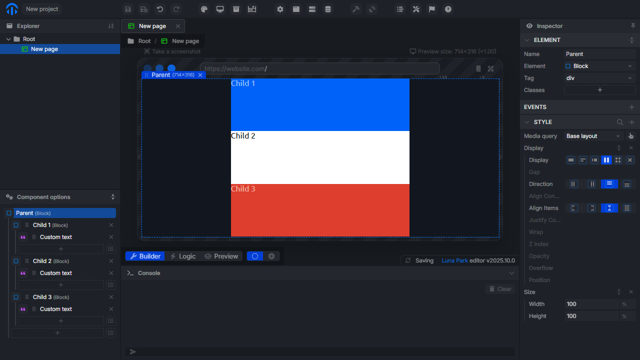
| Flex | Flexible organization of children (direction, wrap, alignment). |
| Grid | Grid organization with defined columns and rows. |
Flex and Grid modes are recommended for structuring complex interfaces.
Alignment (in Flex or Grid mode)
Once a container is in Flex or Grid mode, several properties control the position of children:
| Property | Description |
|---|---|
| Direction | Defines the display direction: row, column, row-reverse, column-reverse. |
| Justify Content | Aligns children on the main axis (defined by Direction). |
| Align Items | Aligns children on the secondary axis. |
| Gap | Space between children (horizontal and/or vertical). |
| Wrap | Indicates if elements should wrap to the next line when space is insufficient. |
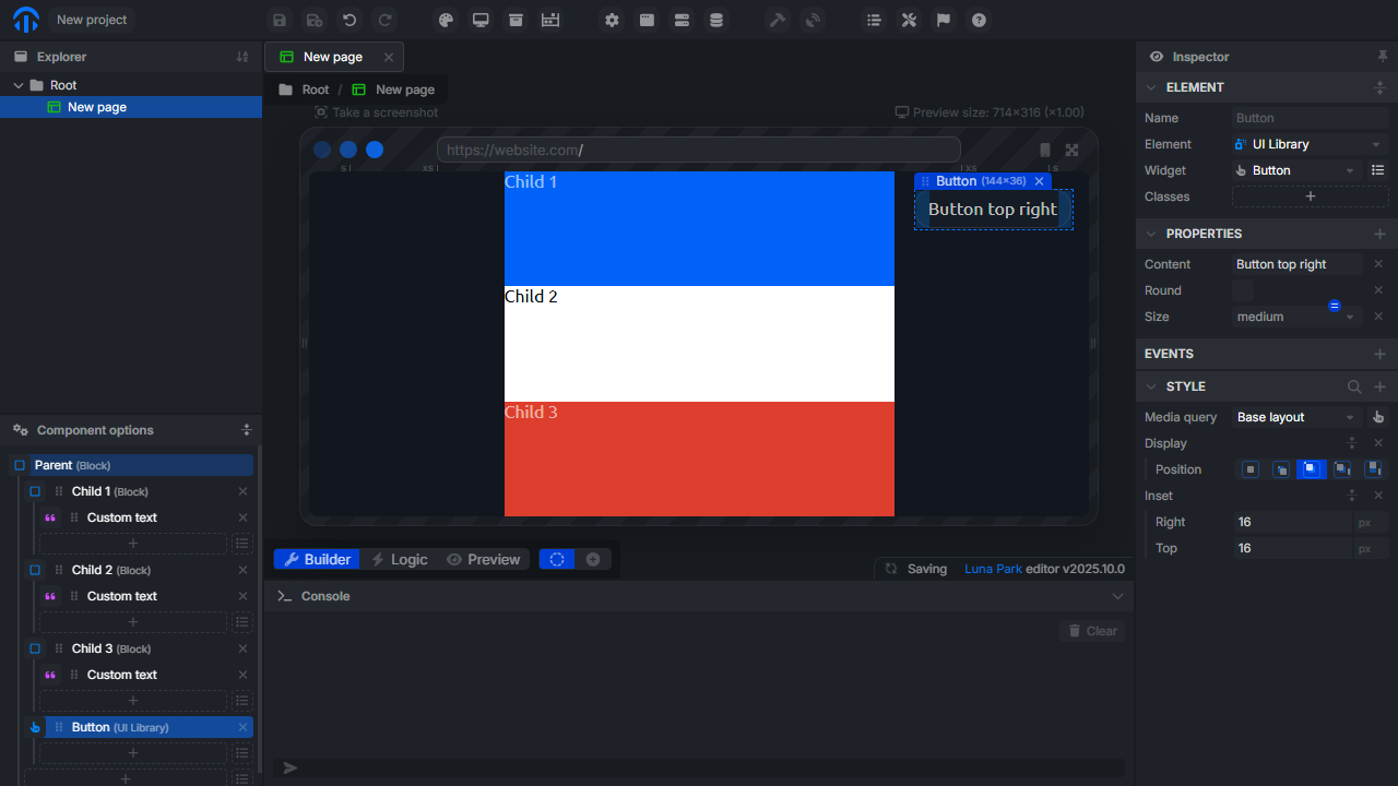
Absolute Positioning
For cases requiring free placement (overlays, badges, tooltips), you can enable absolute positioning.
| Property | Description |
|---|---|
| Position | Switches the element to absolute or relative. |
| Top / Right / Bottom / Left | Defines the exact position within the parent. |
| Z-index | Manages layering between elements. |
Best Practices
- Use Flex for simple layouts (bars, columns, lists).
- Use Grid for complex structures (tables, dashboards).
- Avoid absolute positioning except for specific UI cases.
- Prefer gaps to manual margins for consistent responsive rendering.
Going Further
Luna Park relies on the same principles as CSS. If you want to deepen the logic behind these properties: